 Yesterday we looked at the best historical fashion choices by each team in the NL. Today it's the junior circuit's turn. One change today, though. Based on the suggestion of some readers, I have decided to link to actual photos of actual players wherever possible rather than linking to the Hall of Fame database. ShysterBall is not exactly a big bandwidth hog, but please let me know if any of the links die during the day.
Again, 100% my opinion, and you know what they say about opinions.
Red Sox
Best: For all of Boston's adherence to tradition, there have been a few subtle changes over the Years. Red hats, for one thing. Changing the lettering on the road unis from blue to red. All in all, I prefer the unadulterated classic, with blue "Boston" on the roadies.
Worst: The Red Sox' flirtation with doubleknit pullovers -- while briefer than most teams' -- looked particularly bad for the same reason the Cardinals' did: trying to update a classic. Still, the worst Red Sox uniform earns the title less due to aesthetic considerations than symbolic ones. In a word: pinstripes. Could you imagine that today?
Suggestions: Go back to the blue block "Boston." Otherwise, you're just fine.
Suggestions: Go back to the blue block "Boston." Otherwise, you're just fine.
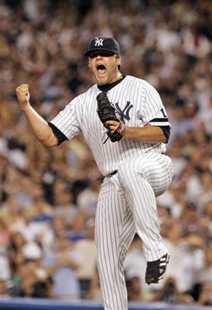
Yankees
Best: Along with the Dodgers and a team to be named later, the Yankees sport the best uniforms in baseball and almost always have. Classics never go out of style, and the Yankees pretty much define classic baseball wear. Be it 1947, 1957, 1977, or 2007, the Yankees have always looked good.
Worst: This is relative, but did you know that while the interlocking "NY" first appeared years before, it didn't permanently stick on the Yankee pinstripes in its current form until 1936? Weird, huh?
Suggestions: If it ain't broke . . .
Suggestions: If it ain't broke . . .
Blue Jays
Best: With no traditional baggage, the Jays were able to do things like stick a bird's head in the dead center of the jersey. And you know what? It looked pretty good. And, like their Canadian cousins the Expos, the Jays are a team that should be required to wear powder blues. It's been almost 20 years since they switched to gray for the roadies, and it still doesn't look right to me.
Worst: The current unis lack the simple bird logo I grew to love as a kid. Like so many teams searching for a sartorial identity, the Blue Jays seemed to have focus-grouped their current duds, and the result is simply boring.
Suggestions: If they're not going to embrace the big Jay head in the middle of a pullover shirt, they should at least try to do something memorable and maybe even a little audacious. Maybe a 1960s-style cartoon bird?
Suggestions: If they're not going to embrace the big Jay head in the middle of a pullover shirt, they should at least try to do something memorable and maybe even a little audacious. Maybe a 1960s-style cartoon bird?
Worst: Didn't much care for the neon. Seeing a legend like Wade Boggs having to wear it was particularly upsetting.
Suggestions: They could be wearing Hugo Boss and still look terrible under the Tropicana Field roof, so a new stadium is all I can recommend.
Suggestions: They could be wearing Hugo Boss and still look terrible under the Tropicana Field roof, so a new stadium is all I can recommend.
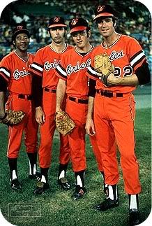
Orioles
Best: They've changed more than you might remember, switching between cartoon and realistic birds, predominantly black hats and white hats, and periodically trying out more orange than they probably should. Ultimately I have to go with cartoon bird, black hat, script "Orioles."
Worst: 1971, but only for the all-orange alternates, which no one should have ever let get within 100 yards of Boog Powell.
Suggestions: More cartoon bird.
Suggestions: More cartoon bird.
Tigers
Best: My vote for the best dressed team of all time. At least home unis. The white, dark blue, and English D, which -- with one unfortunate exception -- stuck for good in 1934, is as sharp as it comes. The ensemble just works for me like no one else's.
Worst: For as solid as the home uniforms are, the Tigers have messed around with the road uniforms quite a bit. As far as these go, I have a sentimental attachment to the pullovers of 1972-93. The worst one was the orange-billed thing of the mid 90s.
Suggestions: I know there is far more history behind the script "Detroit" on the roadies, but I'd love to see them return to the block letters of those 70s-80s jerseys. Short of that, have they ever considered doing a gray English D?
Suggestions: I know there is far more history behind the script "Detroit" on the roadies, but I'd love to see them return to the block letters of those 70s-80s jerseys. Short of that, have they ever considered doing a gray English D?
Indians
Best: Because I despise Chief Wahoo, just about everything they've worn for the past 60 years is off the table for me. Know what? I'd prefer these wacko 1921 uniforms to anything with the Chief on them. At least they came from a positive impulse. 1946 is probably a bit more practical, and not bad looking either.
Worst: Anything with Wahoo. Non-Wahoo category: the all-red 1975-76 ensemble was certainly an interesting choice. They got those just in time for Boog Powell to join the team, which means they must have thought that he looked good in those all-oranges in Baltimore a few years prior.
Suggestions: Do I have to say it again?
Suggestions: Do I have to say it again?
Twins
Best: They've really only had a couple of uniforms in Minnesota over the past 48 years. If I have to choose, I'll go with the pinstripe-free jobs with the interlocking "TC" of the early 70s.
Worst: The World Series years pinstripes with the M on the hats. This is more of a personal, visceral thing in that 1987 was the last year I really rooted for the Tigers -- the switch to the Braves occasioned by my move to West Virginia would be complete sometime that year -- and those were the Twins jerseys that knocked Alan Trammell and the gang out of the World Series appearance to which they were seemingly entitled. Four years later, they were the same jerseys that beat the Braves in an epic Fall Classic. Seeing them simply causes me pain.
Suggestions: Stick with the "TC" hats, and if they haven't already, bring back the giant Twin cartoons for the sleeves.
Suggestions: Stick with the "TC" hats, and if they haven't already, bring back the giant Twin cartoons for the sleeves.
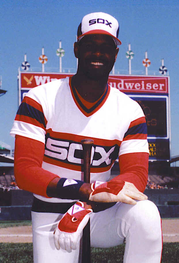
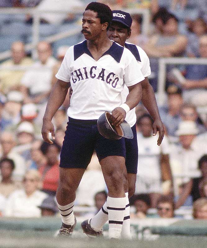
White Sox
Best: For as much as I like the interlocking big "S" and little "o" and "x" of the 1920s-1940s, I probably have to admit that today's White Sox uniforms are the best they've ever had.
Worst: Where do we begin? You know, for as bad as the big pajama uniforms were, there are days when I think they weren't as bad as the doubleknits that replaced them. At least the blousey blue and whites looked comfortable. The doubleknits? Not so much. In the end, though, it's hard to discount the true wretched wrongheadedness of shorts on ballplayers.
Suggestions: The White Sox have had so many different looks over the years, they should do throwback days every weekend.
Royals
Best: The classic Royals (with the number) is one of the sharper uniforms around. I go back and forth on the powder blues vs. grays. At a loss, I asked Royals fan-in-chief Rob Neyer what he thought about it. Rob's view:
I would go with powder blue for the roadies, but only 1) if they do it right, and wear the same colored pants (which I believe they're not doing this year), and 2) if other teams are NOT doing it. Fundamentally, all-powder-blue uniforms don't look particularly good, but in 2008 they work because of the novelty effect.
I should note that we have to take anything Neyer says on the subject with a grain of salt, because in the same email in which he opined on the Royals, he said he liked the 1936 Reds atrocities as well. Still, I have to agree with him on the Royals and the merits of the all-or-nothing approach. If you don't wear powder blue pants, you should just leave the shirts at home as well. The Royals, I think, should go all powder blue, and no one else but the Blue Jays should be allowed to follow.
Worst: While not a crime against nature or anything, the vests and black accents were a rather unfortunate nod to cynical trends.
Suggestions: I'm struggling to think of a franchise to which a single player -- in this case George Brett -- looms so much larger in its history than any other. In light of that, the Royals should probably never wear anything George Brett didn't.
Suggestions: I'm struggling to think of a franchise to which a single player -- in this case George Brett -- looms so much larger in its history than any other. In light of that, the Royals should probably never wear anything George Brett didn't.
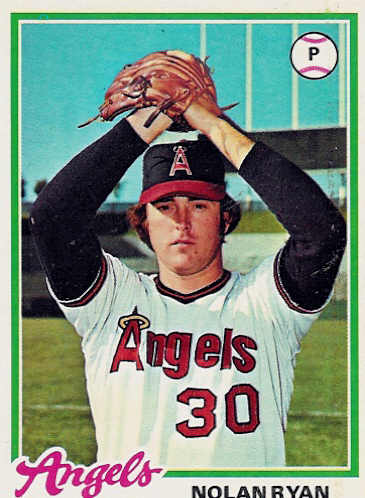
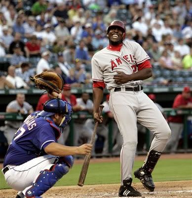
Angels
Best: The halos on the hats and over the A in "Angels" is a pretty sweet look. The current version gets demerits for not putting a city name on the roadies after causing Anaheim all that trouble in switching to "Los Angeles" a couple of years ago.
Worst: Dear God, the Angels looked terrible for a while.
Suggestions: Either go back to being called the California Angels, or else put "Los Angeles" on the front of the jerseys.
A's
Best: Confession time. I played little league baseball in Parkersburg, West Virginia for a team sponsored by something called Doug's Family Hairstyling. All of the other teams were sponsored by sporting goods stores or hardware stores or something manly. We were not only the worst team in the league, but we had a pansy name. Even worse: the uniforms were ugly. Green and yellow, and man do I look terrible in yellow.
I may have hated the A's traditional green and yellow uniforms before then, but I know I hated them afterwards. I still hate them. Simply can't stand the combination at all. My failure to develop a man crush on the A's like so many of my sabermetric friends has a lot to do with the green and yellow. Don't even get me started on the white shoes. As a result, if I have to pick a favorite A's ensemble, it's going to be from Philadelphia or pre-Finley Kansas City. I'll go with the blue elephants.
Worst: They are all awful, but 1973 presented the most variates of awful.
Suggestions: Green and yellow should be outlawed.
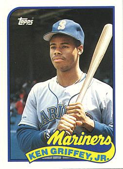
Mariners
Best: Call me crazy, but I loved the original look with the trident M.
Worst: The big yellow S on the 1987-92 caps was a pretty lazy design. To be honest, I haven't liked much of what they've done in the past 20 years.
Suggestions: They don't have to go pullover and powder blue, but I'd love to see the trident M make a comeback.
Rangers
Best: The 1970s-early 80s look is what I still think of when I think of the Rangers. I think it's the font. No one would ever choose a font like that today. Its uniqueness is a virtue.
Worst: The experiment in red from the mid 90s was a mistake.
Suggestions: I'm not sure why the big "T" on the hats is so sacred. I'd love to see them mess around with a star or the shape of the state or something. It's not like there are a bunch of Ranger traditionalists around who are going to take offense.
So that's that. My apologies to Paul Lukas for stealing his bit.

13 comments:
The Rangers' change to red unis coincided with the move to The Ballpark, where brick red is a thematic color, and left behind the blues with memories of unlamented Arlington Stadium. I loved the reds; they looked good in the new yard. Unfortunately they've gone back to blues, and this is not harmonious.
And, remember, they actually won a few division titles in reds. Daniels and Hicks should be paying attention to this.
Your discussion of the Orioles's all orange unis immediately brought to mind a comment I read at the time (probably in SI; it's not coming up in Google) describing Boog Powell as looking like a "walking blood blister."
Excellent work, as always.
Another great post. I'm an Orioles fan and noted that you criticized the Angels for lacking a city name but didn't do the same with the O's. Ever since the the O's dropped "Baltimore" from their road unis, there have been a vocal fan contingent trying to get it back. I have to agree with them, but I also think there are more important reasons to lament the poor management of the franchise over the last decade.
Overall I prefer city names to team names on roadies, so yes, the Orioles deserve criticism for that. I singled out the Angels, though, because they took the extra step of changing their actual name to Los Angeles a couple of years ago, truly alienating the locals in a way that Baltimore never did. To go through all of that trouble and to not put that so-wanted "Los Angeles" on their jerseys seems strange to me. I mean, go all the way or freakin' forget it.
"Angels worst" link doesn't appear to be working... great article!
Here's another vote for the Olde English D as the best-looking uni of all time. But I am a bit torn between the script and block Detroit on the road unis...
Overall, I think they're pretty slick right now. Heck, even their Negro League tribute Uniforms look good in Detroit:
http://www.balgavy.com/sports/baseballgames2004/archives/IMG_7449.jpg
Melody -- I just checked and it seems to be working now. These posts have been so link-heavy that I think I've been getting some weird glitches in the matrix. I'll keep my eye on it, though.
Jake: on pure aesthetics, you're probably right about the current road uniforms. They really do look good. I just grew up with the Tigers in their pullovers, and despite all of the bad polyester pullovers out there, I have always loved Detroit's version. Total emotional blind spot on my part, I'm sure.
APBA Guy-
If you had to show the Birds in all orange, it least you picked the 4 20-game winners: Cuellar, Dobson, McNally and Palmer.
What an era. Do you think Angelos evr sees those unis in his nightmares?
If I'm an Orioles fan I'd take all orange -- or all pink for that matter -- if it meant the return to 1970s glory.
I don't think Angelos sees anything beyond the aura of his self-perceived awesomeness.
I like all-orange. I want the Orioles in that stuff. I'm probably the only one.
That said, I also want a return to the cartoon bird (never won a WS without it). I don't care about the "Baltimore" on the road unis all that much, but we might as well. It's not like we can fool people in Northern VA any more.
Great post.
Re: The Angels' ugly uniforms, you're 100% right. I would like to point out that the blame for those falls on Disney, their owners at the time.
Re: Your remark about "I'm struggling to think of a franchise to which a single player -- in this case George Brett -- looms so much larger in its history than any other" I would say that San Diego is a candidate for that description, as is Colorado, and perhaps Minnesota.
I seem to like the red Rangers uniform better. As you said, opinions are....
And agreed. The current White Sox uni is by far and away their best. A classic design that's fitting for a long-time team. Those 70's uniforms they wore were simply horrifying.
Great article. I agree with a lot of your judgments, but I differ in a few key areas:
Orioles. I know I'm in the minority here, but the realistic bird is a huge improvement over the cartoon bird, which looked silly on grown men. I agree that road uniforms should feature the name "Baltimore."
Blue Jays. I hate their current look, but I don't agree that bringing back the pullover is the answer. The original bird logo is very nice, I agree, and could be incorporated into a new design. They need to ditch the black.
Royals. No team should wear all-powder blue, which used to make me shudder--George Brett notwithstanding. Powder blue jerseys--OK, but the effect should be mitigated with dark-gray pants. I agree their home uniforms look great.
A's. While I agree that the white shoes have always been an abomination, I feel their uniforms have improved significantly over the Charlie Finley days. The darker green is much preferable to the kelly green of the 70s. I actually like these uniforms.
Tigers. Script "Detroit" is definitely an improvement over the boring block letters. I agree that their home uniform is especially handsome.
Red Sox. I feel the old Red Sox road uniforms with the block letters that you like were also boring...but I don't like their current ones either, and I'm a Sox fan. I like the home unis a lot, but I am partial to the older stirrups with the navy-blue-and-white stripes at the top.
White Sox. Agree that their current uni is by far their best look, but they should wear white stirrups. They are the White Sox, after all.
Post a Comment